Accessibility is important to B+LNZ and we work hard to make our information available to and suitable for everyone. We recently added a new accessibility tool to our website to make it easier to access our online information.

We try to address some of the barriers people experience when accessing information, whether due to neurodiversity, low vision, literacy or other considerations such as time or internet connectivity.
Our overall approach
We follow some core principles such as:
- having any given piece of information available in a range of different formats so farmers and others can find it in a way that suits them – and having multiple ways to access that information
- repeating messages in different media to help adult learning
- using Plain English as much as we can and accessible fonts and styles
- getting help from the experts such as the Rural Youth & Adult Literacy Trust.
It’s an ongoing process and we recognise there’s always more we can do.
Our new website widget
Our website has been designed to meet accessibility guidelines and to work on the most common browsers, platforms and devices. We use ‘alt text’ behind images to describe them and we use heading styles consistently through the site to make it easy for screen readers to navigate.
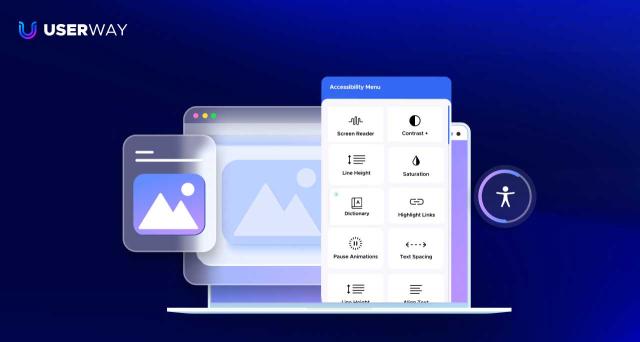
We recently added a new tool by UserWay to make our website even more accessible.
In addition to offering the ability to have words on a webpage read out, it offers a range of accessibility profiles that allow users to:
- change colour contrasts
- make the text bigger, or adjust spacing or line heights
- change pages to a dyslexia-friendly format
- access a dictionary providing definitions for selected words
- change the saturation.
Click on the blue widget (pictured below) at the top right of this page to explore the options.

Other accessibility work
Earlier this year our research team started trialling new slides for presentations to better meet the needs of a range of audiences. This meant changing design aspects like colours, contrast and fonts and using more images rather than words.
We received really positive feedback about the improvements and are looking to update our general B+LNZ presentation slides as a result.
We’ve made some improvements to other resources, such as making shorter podcasts and videos and adapting them for different literacy levels or making it easier to jump to sections of interest.
We also recently introduced ‘Voicenotes’ for lucerne management, which are short (one minute) audio clips on good management practice for lucerne, that we send out at key times via text message.
More information
- Check out the Accessibility page on our website.
- If there’s something accessibility-related you’d like to discuss, start with our friendly Resources team – you can reach them by emailing resources@beeflambnz.com
- Watch this general video about the UserWay Accessibility Widget.